How Suicide Cases are Distributed Across Ages? A Data Story
Note: This article was originally published on Medium.
In this blog post, we go through an animated data story that explores the question: what is the age group that has the highest suicide cases across the years?
The post will also discuss how the suggested data story is an improvement over the visualization published originally with the dataset.
Dataset
The dataset contains the registered number of suicide cases across England and Wales, from 1981 to 2017, for ages ranging from 10 to 89 year-old. The original dataset can be found in this link.
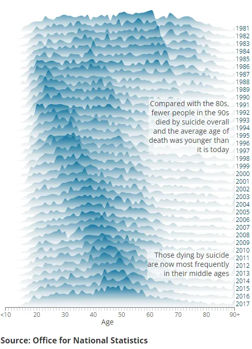
Original Visualization
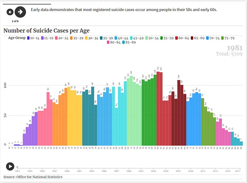
This is a snapshot of the story, for the full animated story visit this link.
Change over Time Story
The original visualization from the Office for National Statistics. An interactive version is available through the this link.
The proposed data story shows how suicide numbers are distributed across ages in four key years:
Starting in 1981, where cases occur among people in their 50s and early 60s, this is contrasted with year 1990, where much younger people, people in their 20s are committing more suicides.
Moving to year 2008, a trend appear where the age group of highest registered suicides is shifting up, now at 40+ year-old.
The trend continues in 2014 where the graph shows people in their 50s are the highest age group in term of suicide cases.
The story ends by showing an animated visualization where data changes over time.
One year at a time:
Even though the original visualization is interactive, where you can view different years separately and go through the age distribution over the timeline, animated data stories provide a more intuitive and less intimidating view, where data for each year is shown in a separate frame.
Grouping data:
Furthermore, the proposed story put ages into groups that are color coded, this has the effect of focusing the attention on smaller number of variations across time.
Aggregating data:
The story also shows the total cases per year, which is a useful piece of information in addition to the age distribution.
Bar charts vs. Area charts:
On the other hand, the story uses bar charts instead of area charts. Bar charts provide a cleaner way of showing low level details, where the case count of a specific age is shown as an annotation on top of individual bars.
Lost message:
Due to the condensed nature of the original visualization, the message that “older and older people are committing suicides across the years” is lost and is only recoverable when the user carefully go over the visualization year by year. However, with our data story, we deliver the message more eloquently through animation.
Limitation and Biases
The dataset is limited to the registered cases, which raise the question on how unreported cases affect the conclusion.
Furthermore, any conclusion drawn from the data is only applicable to England and Wales, and cannot be directly generalized without more diverse data.
References:
The Data Story: https://public.flourish.studio/story/1802895/
The Original Visualization: https://www.ons.gov.uk/visualisations/dvc661/suicides/index.html
The Dataset: https://www.ons.gov.uk/visualisations/dvc661/suicides/datadownload.csv